BLOG
THE CONDUCTOR
Thank you! Your submission has been received!
Oops! Something went wrong while submitting the form.

Search Engine Optimization
Business
Startups Don’t Need SEO? Think Again: The Real Growth Formula for eCommerce Founders
December 12, 2025
eCommerce startup founders often overlook SEO. Learn why performance driven SEO still fuels long-term growth, supports paid media, and prepares your brand for the AI era.

Business>White Label Marketing
Digital Marketing
In-House vs. Agency Programmatic: Choosing the Right Media Delivery Strategy for Your Brand
November 3, 2025
Discover the pros and cons of in-house vs agency media strategies. Learn about media planning, buying, and hybrid models for optimal ROI and brand control.

Performance Delivered Podcast
Trust as a Growth Driver in B2B: Insights from Kristin Oelke
September 11, 2025
Trust is the missing link in B2B growth strategies. Learn from Kristin Oelke, founder of Brightrose Services, how to identify trust gaps, rebuild credibility, and turn trust into your most powerful competitive advantage.

Search Engine Optimization
LLM.txt: Why this “GEO file” isn’t worth your dev resources
September 5, 2025
Wondering if you need an llms.txt file? Here’s the truth: it’s a proposal, not a standard. No impact on rankings or AI Overviews today—focus instead on content, structure, and schema for real results.
.png)
Performance Delivered Podcast
Human-First SEO Skills in the Age of AI
September 4, 2025
In Episode 3 of the AI vs. Search series, Steffen Horst, Lindsie Nelson, and Andreas Voniatis reveal why empathy, validation, and adaptability are the timeless SEO skills that matter most in an AI-driven search landscape.

Performance Delivered Podcast
The Modern CMO Challenge: Insights from Karl Van den Bergh, CMO of Illumio
August 28, 2025
Discover why the CMO role is harder than ever and how to succeed. Illumio CMO Karl Van den Bergh shares insights on building trust, leading with authenticity, and leveraging AI in marketing.

Performance Delivered Podcast
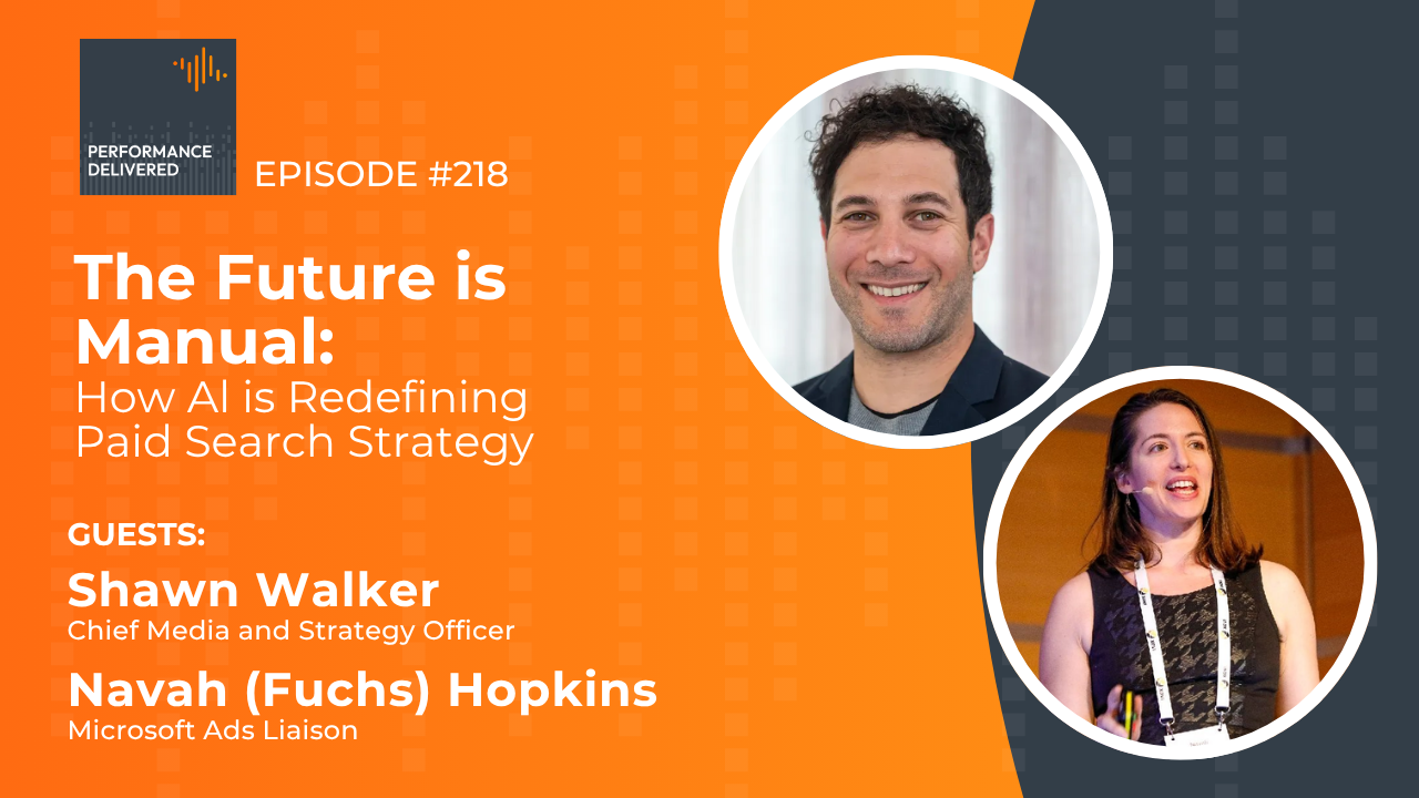
The Future Is Manual? How AI Is Redefining Paid Search Strategy [Part 2]
August 14, 2025
Discover expert insights from Navah Hopkins (Microsoft) and Shawn Walker (Symphonic Digital) on when to use AI vs. manual bidding, brand differentiation, data analysis, and budgeting strategies in an AI-first paid search world.

Performance Delivered Podcast
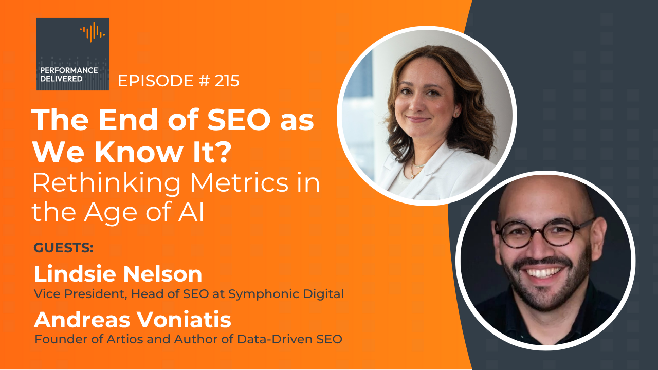
The End of SEO as We Know It? Rethinking Metrics in the Age of AI
July 24, 2025
Discover how AI and zero-click search are transforming SEO. Learn why traditional metrics like traffic and CTR no longer tell the whole story—and what to measure instead. Let me know if you want alternative versions optimized for a different focus (e.g., brand awareness, attribution modeling, etc.).

Performance Delivered Podcast
The Power of Performance: How to Run a Marketing Performance Assessment with Grant Johnson
July 17, 2025
Grant Johnson, CMO at Chief Outsiders, joins the Performance Delivered podcast to discuss how to measure marketing effectiveness, define KPIs, and improve pipeline performance.

Performance Delivered Podcast
AI vs. Search: Is This the End of SEO as We Know It?
June 5, 2025
Discover how AI-powered tools like ChatGPT and Google’s AI Overviews are reshaping search behavior, SEO strategy, and content creation. Learn how to adapt and stay visible in a rapidly evolving digital landscape.

No Posts Match Your Criteria
Try Changing your Filter Parameters!


.png)
.png)


.png)


.jpg)


.png)
.png)
.png)
.png)
.png)
.png)


.png)


.png)


